
Steven Hart
Information Architect
Barclays Bank: data first, interface second
Setting up a new corporate client and getting it ready to trade ('onboarding') at a major bank is not a simple workflow.
A single client, for example, a supermarket chain, might involve:
Hundreds of legal entities
Multiple account types
Regulatory checks across jurisdictions
Data flowing between disconnected systems
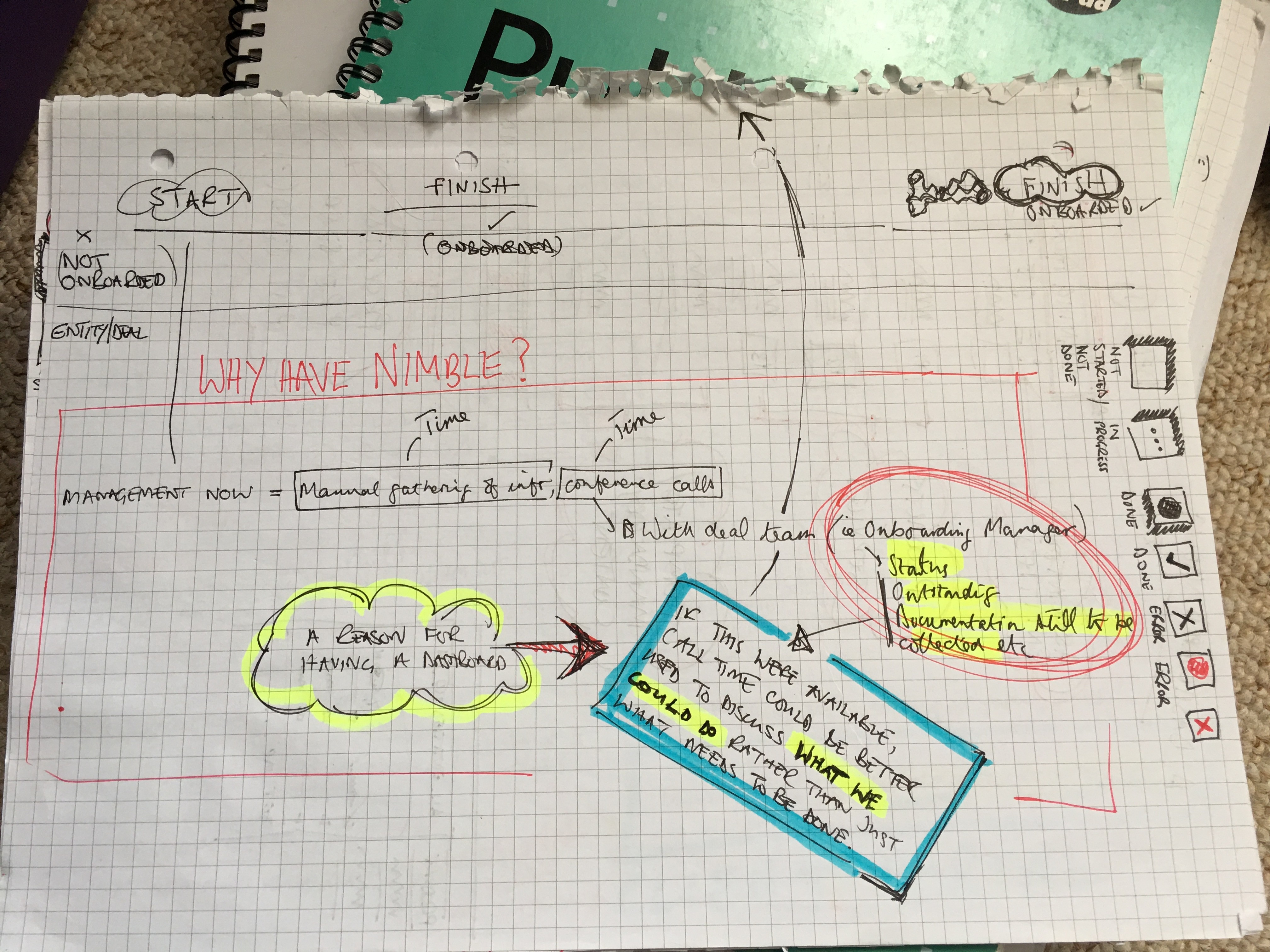
The problem: data organised without respect to workflow
The principal users of the system, Relationship Managers (RMs) were responsible for guiding clients through this process using a system that mirrored internal banking structures rather than the needs of their role.
Early attempts at building the tool suffered from many structural problems, including:
Tasks spread across up to 48 sequential pages
No meaningful sense of progress
Repeated data entry for similar entities
Difficult to track and resume incomplete work.
The result was an onboarding timeline measured in months, and client conversations dominated by administration instead of relationship-building.
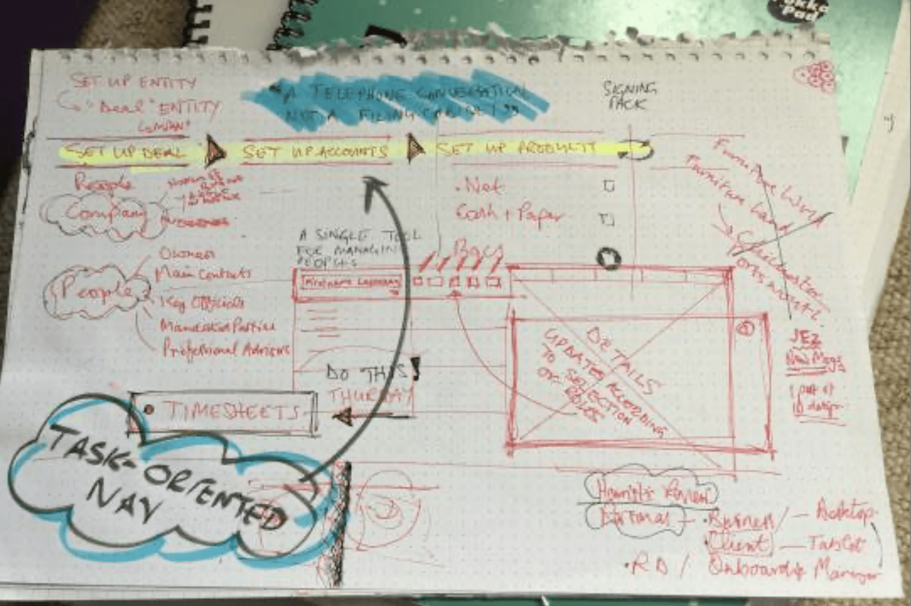
In sketching out alternatives with relationship managers at their desks, one comment stood out:
If all this were available, call time with clients could be better used discussing what we could do for them…
That comment helped frame the problem and the design vision for the project: my role as information architect and designer was to remove the friction from a system that prevented RMs doing their actual job.
I needed to find a way of getting the interface out of the user's way, and instead bring the right data to them at the right time for whatever task they were focused on.

Mapping the system
Onboarding revolves around a set of core data structures:
Company information
Mandated parties
Key officials
Ownership structures
Account configurations
Service selections
Each has its own schema, dependencies on other data, and constraints on when it can be completed.
What looked like a “long form” problem in the interface was actually a network of interdependent data objects that users needed to be able to navigate flexibly and simply.

What the mapping revealed
A complete view of the onboarding system, at a high level of abstraction so it could be seen on one page, mapped entities and tasks, and revealed:
Hidden dependencies
Steps could not be completed in the order presentedOrphan task groups
Some tasks existed without clear context or parent structureUnnecessary duplication
The same data structures repeated across entitiesWorkarounds by experienced staff
RMs routinely bypassed the intended process and instead followed unofficial workarounds, captured in research interviews.
Defining a usable structure
From this work, a simpler and more coherent model of the system emerged:
Deal (client-level view)
Entity (branch, subsidiary, legal unit)
Task (specific data or configuration step)
This simpler task model provided a consistent hierarchy, a way to manage multiple entities in parallel and a foundation for tracking progress across the whole system.
It also made something possible that hadn’t existed before, a single view of onboarding progress across an entire client:

Addressing one source of complexity: recursion
Corporate clients are made up of repeating structures of:
Multiple branches
Multiple subsidiaries
Similar configurations with small variations
The old system forced users to enter the same dataset repeatedly, each time from scratch, for each repeated entity.
Reframing the problem
Instead of treating this as a technical constraint, I rewrote it as a user goal:
“I want to replicate a dataset, then change only what’s different.”
That reframing led directly to a new interaction model, allowing a base data set to be defined, then cloned, edited or applied as required. This pattern applied across the domain, so it made the whole application feel lighter, more intuitive and quicker to use.
This reframing of a data flow - from sequential, repetitive form-filling to structured, re-usable data entry was one of the key steps in collapsing completion time measured in months to weeks, with increased accuracy, and more time for relationship-building.
Once the underlying structure was resolved, the interface followed naturally.
Key features:
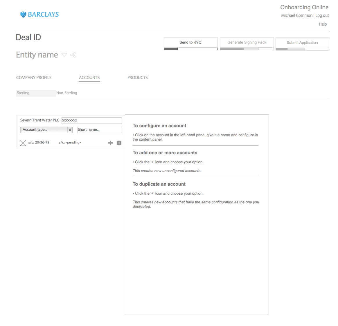
Overview dashboard
All client deals visible in one place
progress and issues surfaced immediately
Entity-based navigation
Clear context at all times
No loss of orientation
Inline data editing
No page-by-page navigation
Direct interaction with structured data
Status visibility
Incomplete, blocked, and completed tasks clearly indicated
The work beneath the work
Mapping data structures, untangling dependencies, resolving gaps between official process and actual practice, seeing the recursion problem as a data question rather than an interaction question: that was the hard work of this project. The interface surfaced the solutions, but the solutions did not originate in design, but in analysis.
This is the pattern I find in most complex systems: the interface problem is a symptom. The structural problem is the cause. Solving one without the other produces a better-looking version of the same failure.
Working across analysis and interface design in parallel — using each to inform the other as the project progressed — meant the structural decisions and the interaction decisions evolved together.
That's faster than the alternative, and produces something more coherent than designing the structure in isolation and handing it to someone else to make usable.
Steven Hart
Information Architect