
Steven Hart
Information Architect

Gatwick Airport: organising knowledge and actions around a single identifier
For the airport traveller, almost everything is determined by one piece of information: the flight number. That single piece of data tells the traveller:
Where they need to be
When they need to be there
Which airport services are relevant
What can be ignored
My work on Gatwick Airport’s website began by recognising this as an organising principle, then rebuilding the total experience around it.
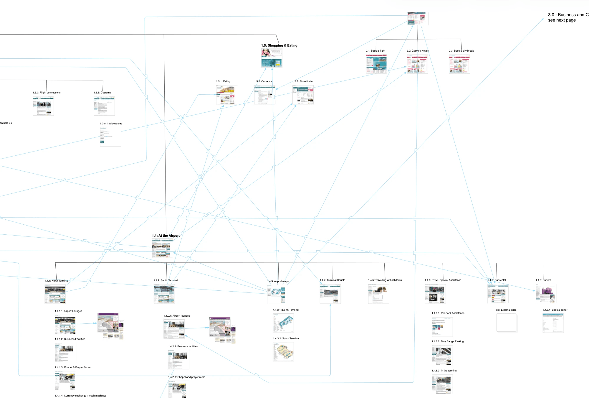
The solution looked like navigation design, but the problem under the surface was that the old website had no organising principle.
The work included content audit and content strategy, defining information architecture for the site with user testing, and creating the interaction framework for the final product.
The problem: complexity without structure
The existing site reflected the organisation's structure, not the traveller's mental model of travelling through an airport.
Problems that created included:
Thousands of pages
Overlapping and stale content
Multiple pathways to the same information
Inconsistent interaction patterns
Instead of helping travellers and reducing their anxiety, it put a high cognitive payload onto the user by forcing them to form their own search, compare, remember and decide strategies as they navigated the vast expanse of informational and marketing content.
The old site exported system complexity directly onto the user, which is a common failure mode of large information systems.
Understanding the domain
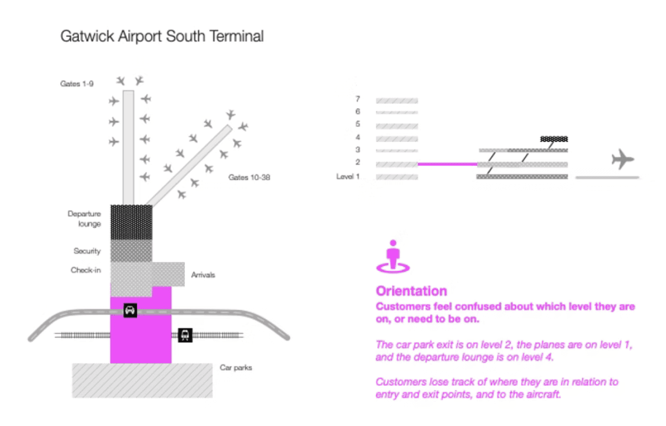
My exploratory work started in the physical environment, not the digital interface. I visited the airport and tried to map arrivals, departures, and transition zones. It became clear that even in real life, the dominant problem wasn’t a lack of information but a lack of orientation.
Being in the airport and walking in the travellers' shoes highlighted recurring questions:
Where am I in the journey?
What happens next?
Am I about to miss something important?
That uncertainty creates cognitive load. Which, when under time pressure, becomes anxiety.
So the objective wasn’t just to "improve usability of the website”, but to reduce cognitive load and anxiety when interacting with the whole airport as a system.
To do that, I used the website to become an explainer for the system.
I wanted to take the task of constructing a usable mental model of the airport away from the traveller, and have the website do that work on their behalf. This would make not just the website, but travelling through the airport itself, easier and less stressful.
The structural insight
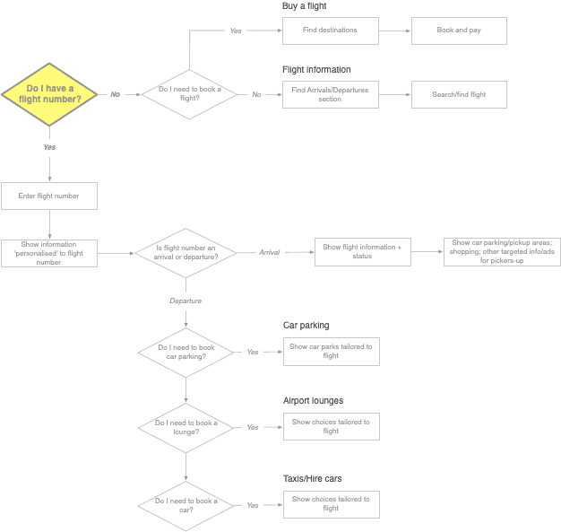
From my field research, including interviews with people travelling through the airport in real life, a consistent pattern emerged: every traveller organised their journey around their flight number.
The flight number therefore acts as a primary key across the entire airport system, connecting:
Terminals
Gates
Timings
Check-in
Security
Shopping
Parking relevance
Onward travel
Once you know the flight number, most other decisions are either resolved or dramatically simplified, and the content can shape itself around that piece of context.
The question was no longer How should we structure the website? but How do we structure an information system so everything can be derived from this identifier?

From designing content, to designing information systems
A good example was the car parking section of the website.
The original site presented more than twenty pages of parking information and options including:
Products
Pricing tiers
Distances
Terminals
Booking flows
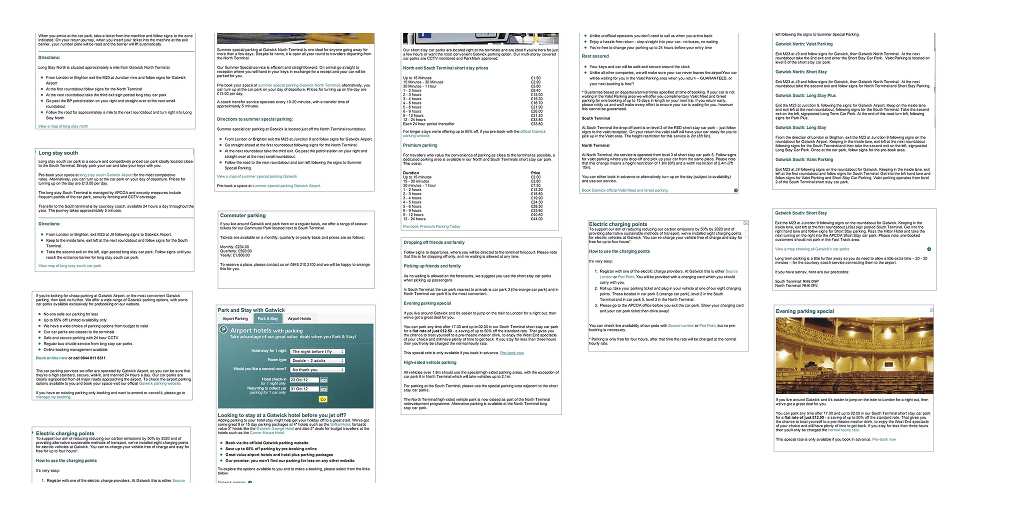
Users had to read, compare, and mentally model the differences before they could select the option that best suited their needs: a decision problem.
I rebuilt that structure around the parking decisions that users actually need to make (the jobs to be done):
Are you departing, picking up, or dropping off?
Which terminal is relevant?
What constraints matter most (time, cost, proximity)?
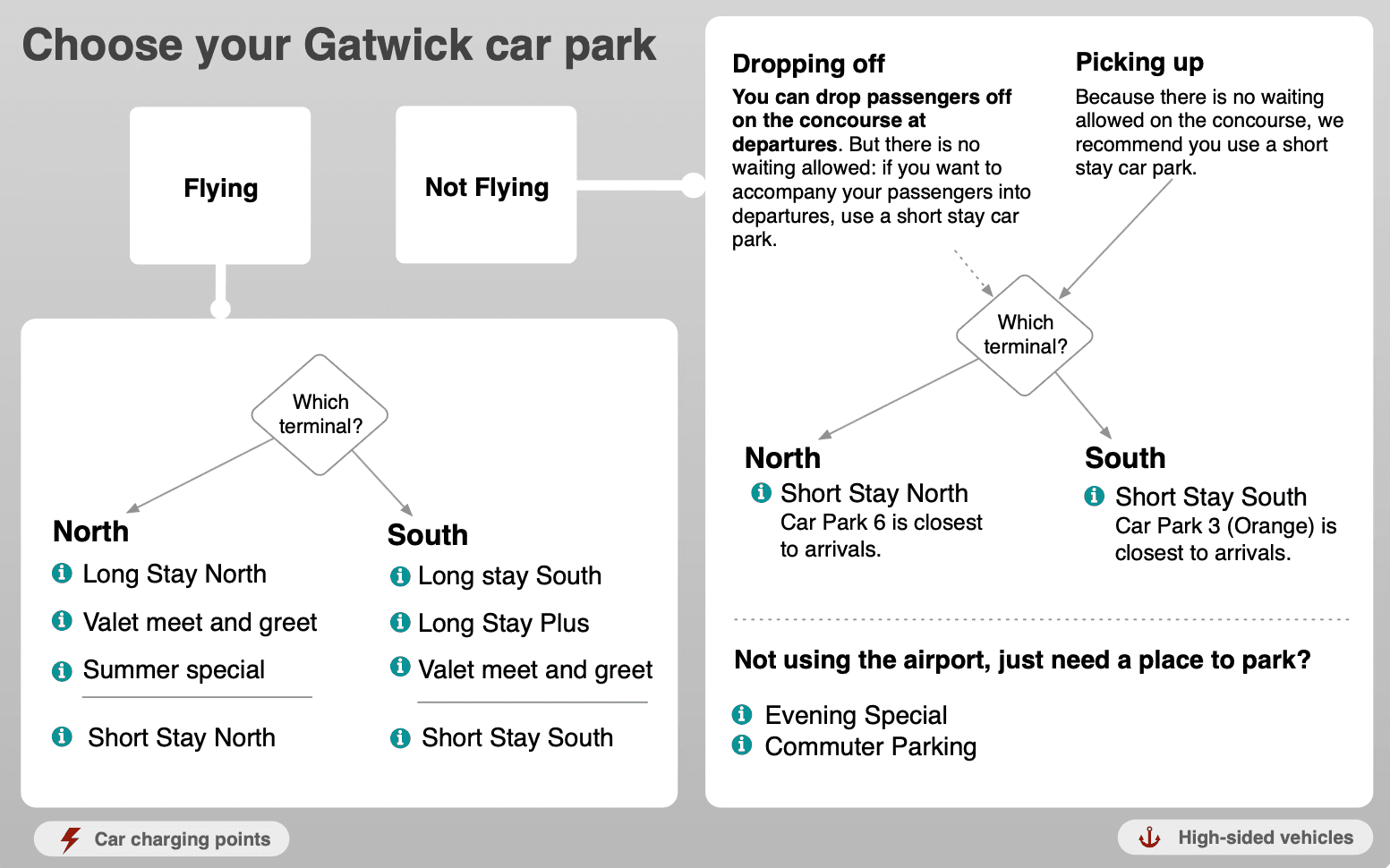
Once those are known, irrelevant options disappear. What was previously a large, flat, unfriendly content set became a structured, interactive decision system.
The product now didn’t just present options, it performed the filtering work on behalf of the user and could be presented much more simply on the front end.

The architecture
With the flight number as the organising principle, and the idea of information systems established as a pattern, site information architecture followed quickly.
The system was structured around the traveller’s real sequence:
Getting to the airport
At the airport
Onward travel
Within each stage, content was dynamically constrained by:
Flight
Terminal
Journey type
This allowed the system to determine relevance instead of asking users to do it manually.
An early attempt to organise navigation strictly around the physical journey—from home to destination—tested poorly. Travellers prioritised “At the Airport” as the primary concern, regardless of sequence.

Interface as a consequence of structure
With a knowledge architecture defined, the interface naturally became simpler. A key shift was from page-based navigation, and towards self-contained, progressive components.
For example:
Complex booking journeys became single, self-contained flows
Irrelevant options were removed upfront
Interaction patterns were standardised
The interface didn’t introduce new ideas, it just needed to express the underlying structure consistently.

Outcome
Winner: EpiServer Best B2C Website of the Year
Significant reduction in content volume
Improved engagement and commercial performance
Multi-year lifespan of core structural elements
One of the decision structures, the check-in flow, was later repurposed by the client as physical signage in Departures. No photograph survives, but the fact that a piece of my digital information design transferred to physical signage felt like vindication of the approach.
Reflection
This project was more than just a website redesign. The real work was identifying organising principles, self-contained flows, and redundant or repeated information.
Then finding ways to put only relevant information in front of people, in a way that matched their own mental model of the system they were navigating.
The thought processes called upon feel very similar to more recent work involving knowledge graph design, data modelling, and design for large-scale information systems.
Steven Hart
Information Architect