Steven Hart
Knowledge Architect
What happens when design thinking shapes the data, not just the interface?
A proof of concept that put a knowledge graph at the heart of a data intelligence platform.
If AI agents are the new users of our products, the structures they read from have to be designed as carefully around user goals as any interface ever was.
This case study shows how user research methods shaped an ontology, and what that ontology then made possible for the product at its human and agent surfaces.
To explore the idea, and to demonstrate the possibilities design thinking is applied at the data layer itself, I built a data intelligence platform powered by a working knowledge graph in Neo4j.
This is an independent, self-initiated proof of concept, developed on my own time. All data, articles, organisations and figures shown are synthetic, created for illustration only, and do not represent any company's actual data, content, products or plans.
Agents don't browse, they traverse
For twenty-odd years, “UX” has (incorrectly but inescapably) been understood as ‘organising things on a screen’: navigation, page templates, search results. As our primary design persona, we've assumed a human who scans, clicks and builds meaning as they go.
But AI agents don't look at a menu or follow a breadcrumb. They query structure directly, follow relationships and assemble answers.
If the meaning of a product lives only in its interface, an agent can't reach it. That moves a large part of UX work down a layer.
The decisions that matter most become: which things exist, how they relate, and what those relationships mean. These are the same questions information architects have always asked, but now we can answer them in the data model itself.
I wanted to test that idea on a real kind of problem, with a working knowledge graph of realistic data at a reasonable scale.
Agents don't browse, they traverse
For twenty-odd years, “UX” has (incorrectly but inescapably) been understood as ‘organising things on a screen’: navigation, page templates, search results. As our primary design persona, we've assumed a human who scans, clicks and builds meaning as they go.
But AI agents don't look at a menu or follow a breadcrumb. They query structure directly, follow relationships and assemble answers.
If the meaning of a product lives only in its interface, an agent can't reach it. That moves a large part of UX work down a layer.
The decisions that matter most become: which things exist, how they relate, and what those relationships mean. These are the same questions information architects have always asked, but now we can answer them in the data model itself.
I wanted to test that idea on a real kind of problem, with a working knowledge graph of realistic data at a reasonable scale.
The scenario: a private markets intelligence platform
I chose a domain where the value sits in connections: private markets, and infrastructure investment in particular.
User research shows that investors declare which strategies, sectors and regions they want exposure to. Those intentions should be traceable to fund commitments, to the managers running those funds, to the companies held in them, and to the news and analysis that gives the market context.
My fictional platform combines editorial content with market data, a common model in this space.
Finding a single fact is easy. Seeing what it means in the wider picture is hard: who else is involved, what is changing, why it matters. Yet building that picture is how professionals actually use information.
There is also a structural gap typical of content-plus-data businesses. Navigation tends to follow how content is produced: news, events, awards, reports.
Users don't think that way. They think in terms of investment intent.
Design thinking applied: ontology as a research problem
For this proof of concept, I started with the questions investment professionals need to answer, using those information needs to guide the domain model rather than simply reproducing the structure of existing content and data..
Using Jobs To Be Done, I framed what investment professionals ask of data. They don't just browse content; they run research strategies.
A typical job sounds like: show me everything relevant to infrastructure in Europe and Asia-Pacific: who is active, who is moving, and what is being written about it.
Three dimensions run through nearly every job like that: Strategy, Sector and Region.
They are how users frame the market in their heads. So I made them first-class parts of the graph, not tags bolted onto content. Every fund, deal, investor and article connects to them, and that gives humans and agents the same entry points into the data.
The working principle was simple: if a user would ask the question, the graph should be able to answer it in one query.
The model
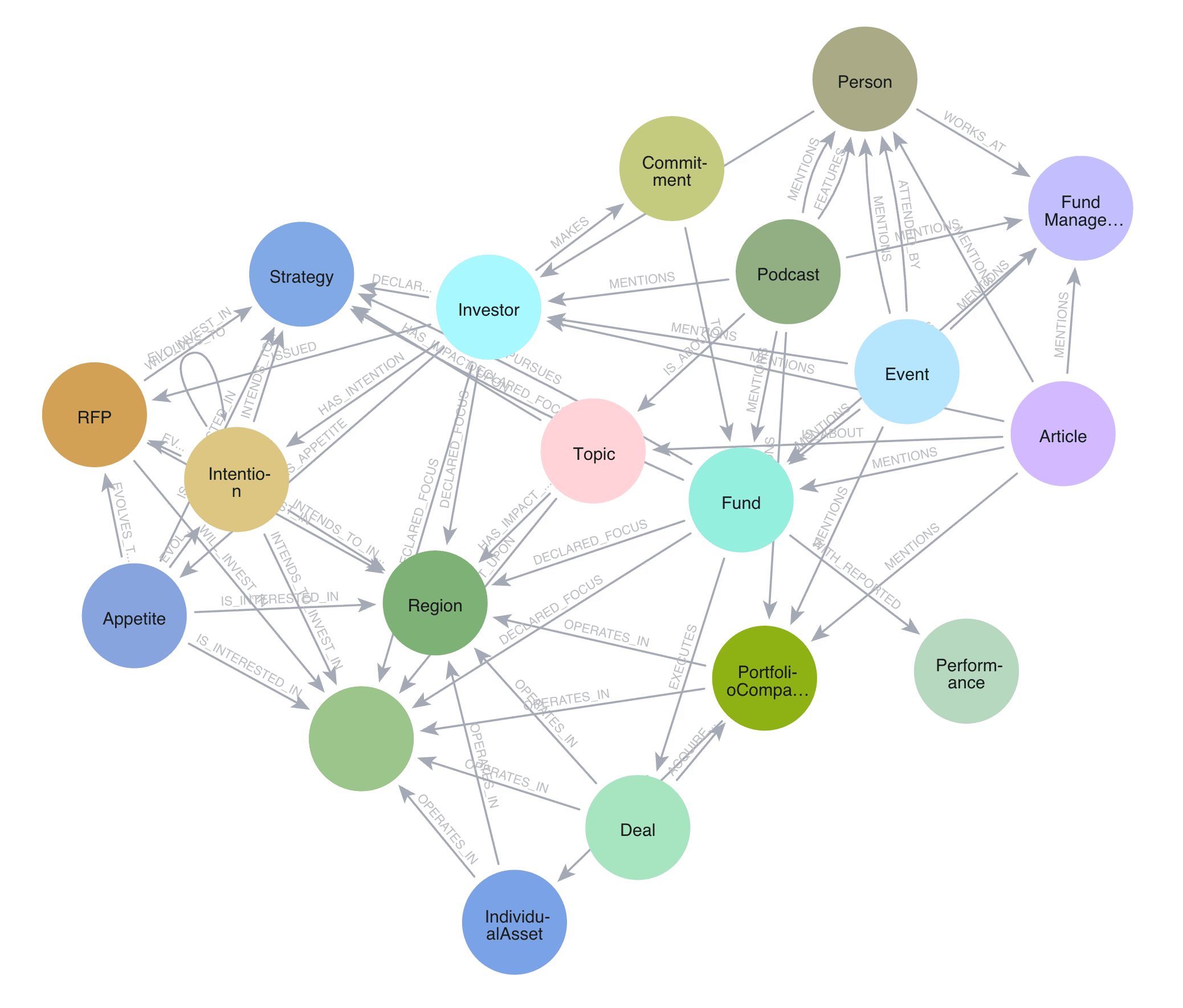
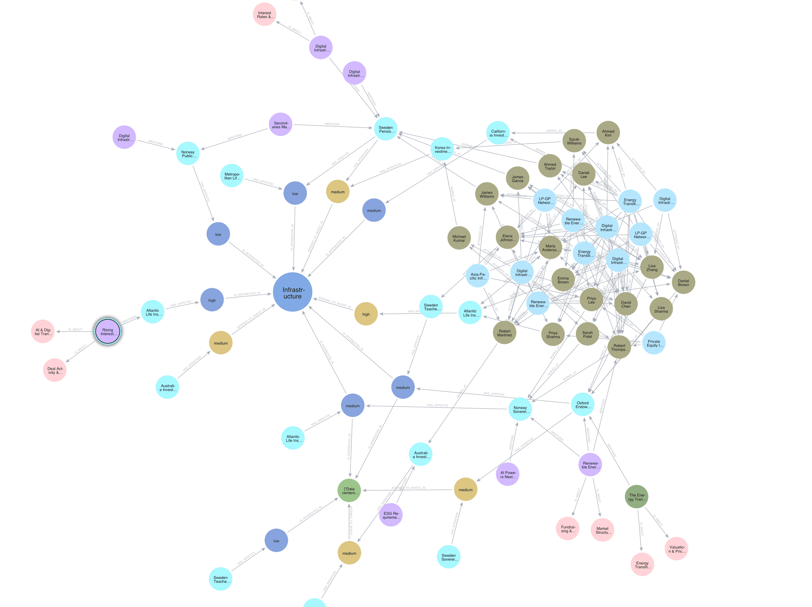
The result is a property graph of 800+ nodes and 1,500+ relationships, built around eight core entity types and five taxonomy dimensions.
The entities describe the market. The taxonomy nodes connect them to the way users think about it. Relationships are named, given direction and, where useful, quantified, so the graph supports multi-hop questions across the whole ecosystem.
Some key modelling decisions
Entity resolution: the same real-world organisation often appears under different names in different sources. Deciding when two references are one entity is non-trivial at scale, and every downstream answer depends on it.
Controlled vocabularies: consistent taxonomies applied across inconsistent source content, so queries return reliable results.
Relationship direction: each relationship points the way that best supports the most valuable questions.
Property design: deciding which attributes belong on nodes and which on relationships, and which carry analytical value rather than display value.
Extensibility: new entity types and use cases can be added without restructuring what exists.
What it enables, for people and for agents
The graph was designed to drive product features directly, not to sit behind them as a backend model. The same structure serves a person reading a page and an agent answering a question.
For people
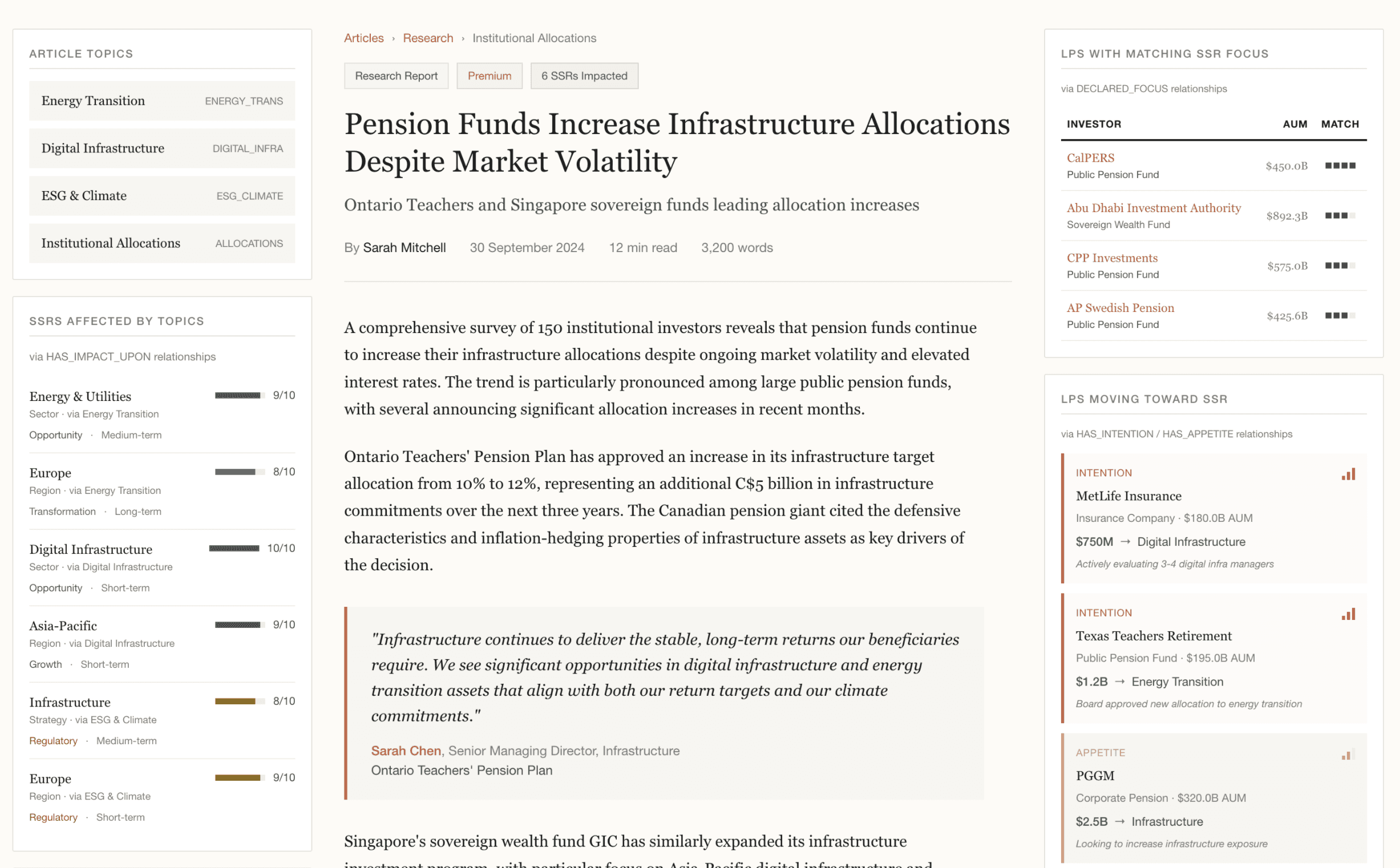
Network intelligence modules: an article or profile page becomes a window onto the ecosystem. Alongside the content it shows investors interested in the topic, funds run by a mentioned manager, and events key people are attending.
Market focus: one control lets users choose a strategy, sector and region and instantly see all the relevant content, data and signals. Behind it is a single graph query.
Strategy alignment: comparing what a fund said it would invest in with what it actually invested in. Without the graph this needs significant manual analysis.
Investor intention mapping: tracing which investors plan to move into which strategies, and linking those intentions to the people, events and articles around them.

Reflection
The hard work was in defining the translation layer: understanding how investment professionals think, then encoding that understanding in a model that is both technically realistic and makes sense to the people using it.
A broader lesson is about where design may sit in relation to data.
As agents become users, the information architecture can no longer live only in navigation and templates. It has to be designed into the data. Designers who understand both people and structure seem well placed to do that work.
Skills used
Domain translation: a complex, relationship-dense commercial domain modelled as a queryable knowledge graph.
Ontology design: entity resolution, controlled vocabularies, relationship direction and property design.
Design research applied to data: Jobs To Be Done used to decide which entities and relationships matter.
Business-technical bridging: the model used as a shared artefact for conversations with design, data and product leaders.
Hands-on build: Neo4j, Cypher, import pipelines and LLM integration for natural-language querying.
The graph runs live, and I'm happy to walk through it, the model and the queries behind it.
If you enjoyed reading this case study, get in touch!
Steven Hart
Knowledge Architect